
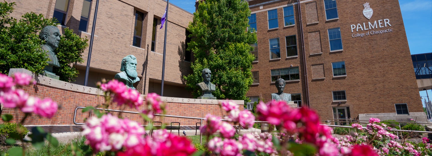
When people look at Palmer College trademarks, they don’t just see logos. They see where chiropractic started, a world-famous degree, and the future of the profession.
In a sense, the College trademarks speak on the institution’s behalf without saying a word. They represent who we are and what we stand for. They are a visual representation of the College’s reputation.
Therefore, it is vital to build and maintain a strong logo and visual identity. To accomplish this, logos must be used in a consistent way. They must have the proper shades of purple and gold, be properly aligned, and be in the proper proportions. They must be used in appropriate contexts.
This abbreviated brand guidelines manual establishes the rules for the College’s logos and additional identity marks. You’ll find what you need to know about using Palmer College trademarks, wordmarks, and logos. Proper and legal use of the symbols protects the College’s image and distinguishes us from other institutions.
Download the abbreviated brand guidelines manual below.